This case study is currently optimised for laptop screens. Tablet responsiveness is coming soon.
This case study is currently optimised for laptop screens. Tablet responsiveness is coming soon.
Reimagining Infinitiq’s Website
Reimagining Infinitiq’s Website
to Improve Value Preposition
to Improve Value Preposition
Scope
Information architecture redesign | Page flow
& section prioritisation | User journey optimisation
Tools
Figma | Figjam | Framer
Year
2025
Timeline
4 weeks

Why Redesign
The website lacked clarity, trust, and clear user direction
The website lacked clarity, trust, and clear user direction
The earlier website made it hard for users to quickly understand what InfinitiQ offers, who it is for, and why it matters. The messaging was generic, the content flow was unclear, and trust signals were limited, which reduced confidence and engagement and made it difficult for users to know what to do next.
The earlier website made it hard for users to quickly understand what InfinitiQ offers, who it is for, and why it matters. The messaging was generic, the content flow was unclear, and trust signals were limited, which reduced confidence and engagement and made it difficult for users to know what to do next.
UX Audit
Problems with the current version
Unclear Value Proposition
Unclear Value Proposition
#Visibility of System Status
Users couldn’t easily understand what InfinitiQ does or how it’s different. The messaging was generic and didn’t clearly speak to school decision-makers.
Users couldn’t easily understand what InfinitiQ does or how it’s different. The messaging was generic and didn’t clearly speak to school decision-makers.
Weak Visual Hierarchy
Weak Visual Hierarchy
#Recognition Rather Than Recall
All sections felt similar in importance. Important information didn’t stand out, making the page feel long and overwhelming.
All sections felt similar in importance. Important information didn’t stand out, making the page feel long and overwhelming.
Low Trust & Credibility Signals
#Aesthetic and Minimalist Design
Users couldn’t easily understand what InfinitiQ does or how it’s different. The messaging was generic and didn’t clearly speak to school decision-makers.
Feature-Focused, not Outcome-Focused
#Match Between System and Real World
The website highlighted features but didn’t explain real-world benefits or outcomes for schools, teachers, or students. This made it harder for decision-makers to see the practical value of adopting the platform.
Unclear Conversion Path
#User Control and Guidance
Calls-to-action were not prominent or consistently placed. Users were not clearly guided toward booking a demo or taking the next step, leading to missed conversion opportunities.
Disconnected Page Structure
#Match Between System and Real World
Content sections felt loosely placed without a clear narrative flow. Users had to scroll and interpret information on their own instead of being guided through a logical story from problem to solution.
Low Trust & Credibility Signals
#Aesthetic and Minimalist Design
For a high-stakes decision like school adoption, users needed stronger proof and reassurance like product images, testimonials etc.
Feature-Focused, not Outcome-Focused
The website highlighted features but didn’t explain real-world benefits or outcomes for schools, teachers, or students. This made it harder for decision-makers to see the practical value of adopting the platform.
#Match Between System and Real World
Unclear Conversion Path
#User Control and Guidance
Calls-to-action were not prominent or consistently placed. Users were not clearly guided toward booking a demo or taking the next step, leading to missed conversion opportunities.
Disconnected Page Structure
Content sections felt loosely placed without a clear narrative flow. Users had to scroll and interpret information on their own instead of being guided through a logical story from problem to solution.
#Match Between System and Real World
UX Audit
Problems with the current version
Unclear Value Proposition
#Visibility of System Status
Users couldn’t easily understand what InfinitiQ does or how it’s different. The messaging was generic and didn’t clearly speak to school decision-makers.
Weak Visual Hierarchy
#Recognition Rather Than Recall
All sections felt similar in importance. Important information didn’t stand out, making the page feel long and overwhelming.
Low Trust & Credibility Signals
#Aesthetic and Minimalist Design
Users couldn’t easily understand what InfinitiQ does or how it’s different. The messaging was generic and didn’t clearly speak to school decision-makers.
Feature-Focused, not Outcome-Focused
#Match Between System and Real World
The website highlighted features but didn’t explain real-world benefits or outcomes for schools, teachers, or students. This made it harder for decision-makers to see the practical value of adopting the platform.
Unclear Conversion Path
#User Control and Guidance
Calls-to-action were not prominent or consistently placed. Users were not clearly guided toward booking a demo or taking the next step, leading to missed conversion opportunities.
Disconnected Page Structure
#Match Between System and Real World
Content sections felt loosely placed without a clear narrative flow. Users had to scroll and interpret information on their own instead of being guided through a logical story from problem to solution.
Target Users
Clearly communicate who InfinitIQ is for
Clearly communicate who InfinitIQ is for
School Leaders & Administrators
Decision-makers who need quick clarity, trust, and confidence before adopting a digital school platform.
Teachers & Educators
Daily users who want simple, time-saving tools to manage teaching and student progress.
School Leaders & Administrators
Learners who expect an engaging, intuitive, and modern digital learning experience.
Parents
Observers who value transparency and clear communication about their child’s education.
Framework
Using the AIDA Framework
Attention
Interest
Desire
Action
Attention: A strong, future-focused headline and polished visuals immediately signal value and relevance to digital schools.
Interest: Engaging explanations of teaching improvements, ecosystem visuals, and product previews maintain curiosity and encourage exploration.
Desire: Clear benefits, AI capabilities, testimonials, and differentiation build trust and make the solution feel essential.
Action: Well-placed calls to action invite schools to take the next step toward digital transformation confidently.
Information Architecture
Organizing the content of the website beforehand is essential
Organizing the content of the website beforehand is essential

Landing Page
Landing Page

Nav Bar

Hero Section

Product Suite

Benefits

Our Story
Logo
Products
Courses
Blog
CTA
Hero Copy
Product Mockup
CTA
Web Application
Teacher Application
Student Application
AI Assistant
Test Scan App
Benefits of Each App
Articles
Redesign
See What’s Changed
See What’s Changed
Product Suite Redesign: Enhanced Usability and Clarity
Product Suite Redesign: Enhanced Usability and Clarity
This redesigned version focuses on making the product suite clearer and easier to use, ensuring more intuitive and user-friendly experience
This redesigned version focuses on making the product suite clearer and easier to use, ensuring more intuitive and user-friendly experience
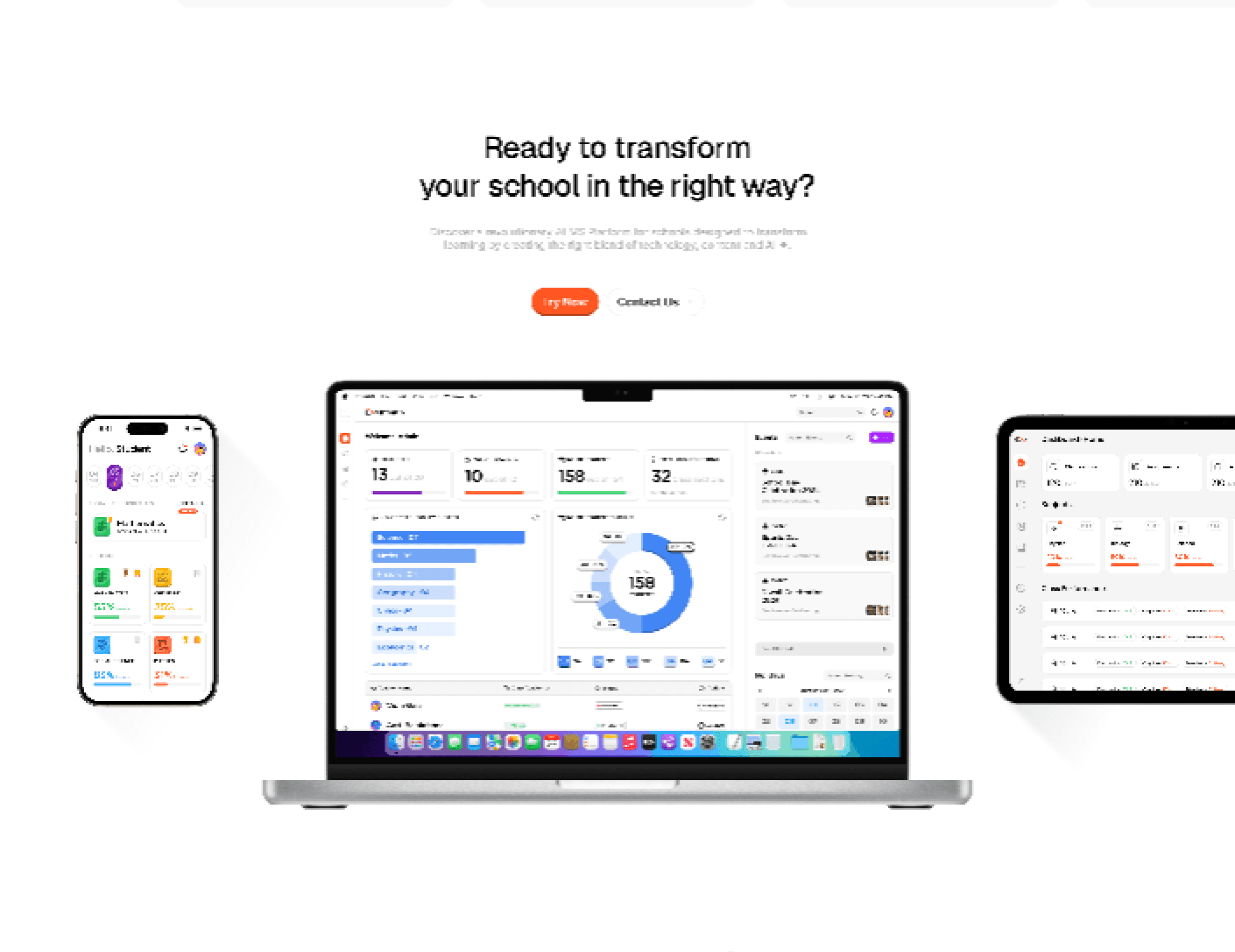
Well Placed CTA’s
Well Placed CTA’s
CTAs are easy to find without being overwhelming. They guide users naturally towards the details of the product and to get in touch with the team
CTAs are easy to find without being overwhelming. They guide users naturally towards the details of the product and to get in touch with the team
Clean Visuals
Clean Visuals
The UI is visually appealing with a modern, clean design. It uses bright, friendly colors that feel inviting for both students and educators, and everything looks polished and professional.
The UI is visually appealing with a modern, clean design. It uses bright, friendly colors that feel inviting for both students and educators, and everything looks polished and professional.